Linkedin just updated its app with a brand new design inside the app.
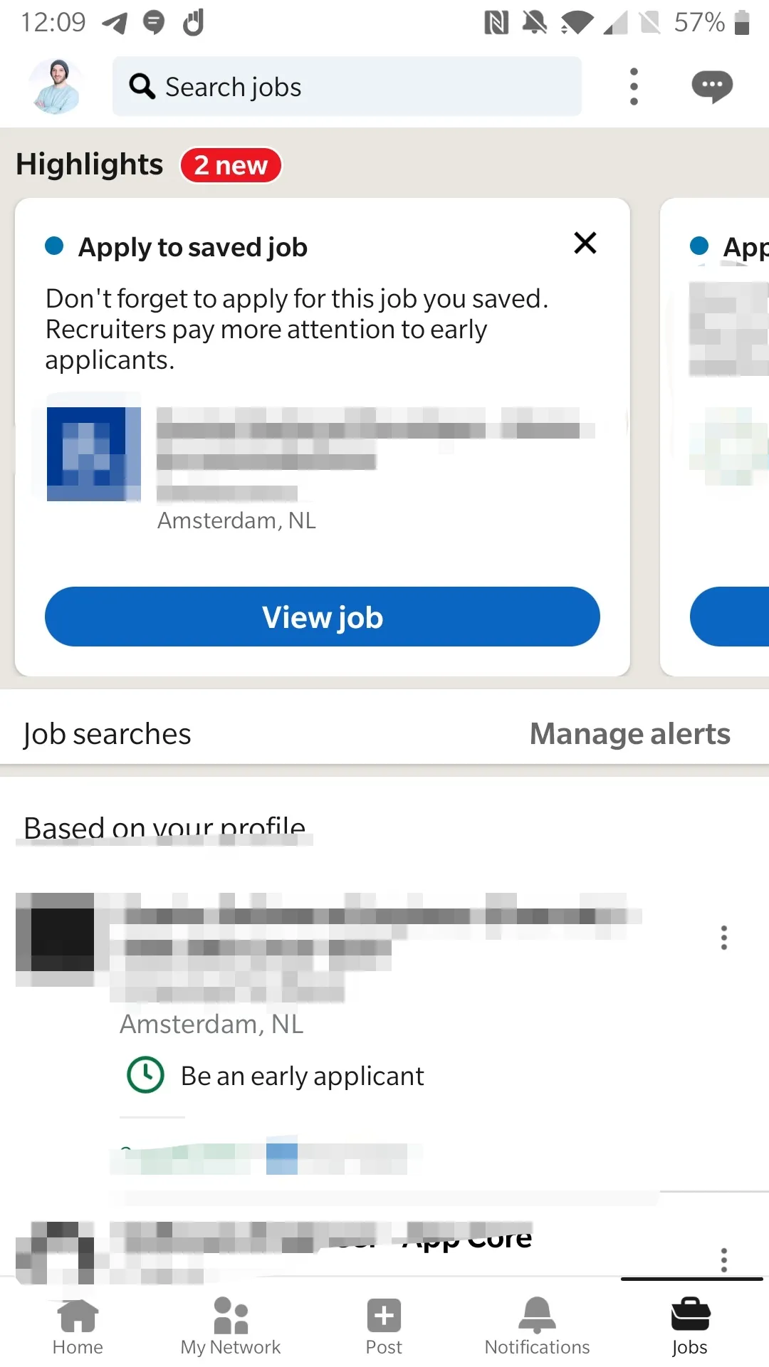
The design touched the main UI:
Which now contains a couple of info regarding messages, updates and so.
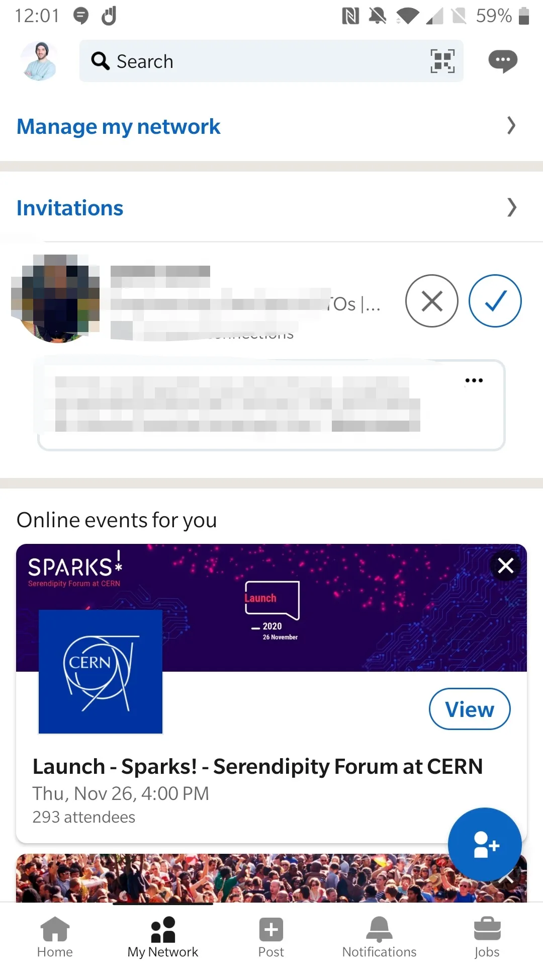
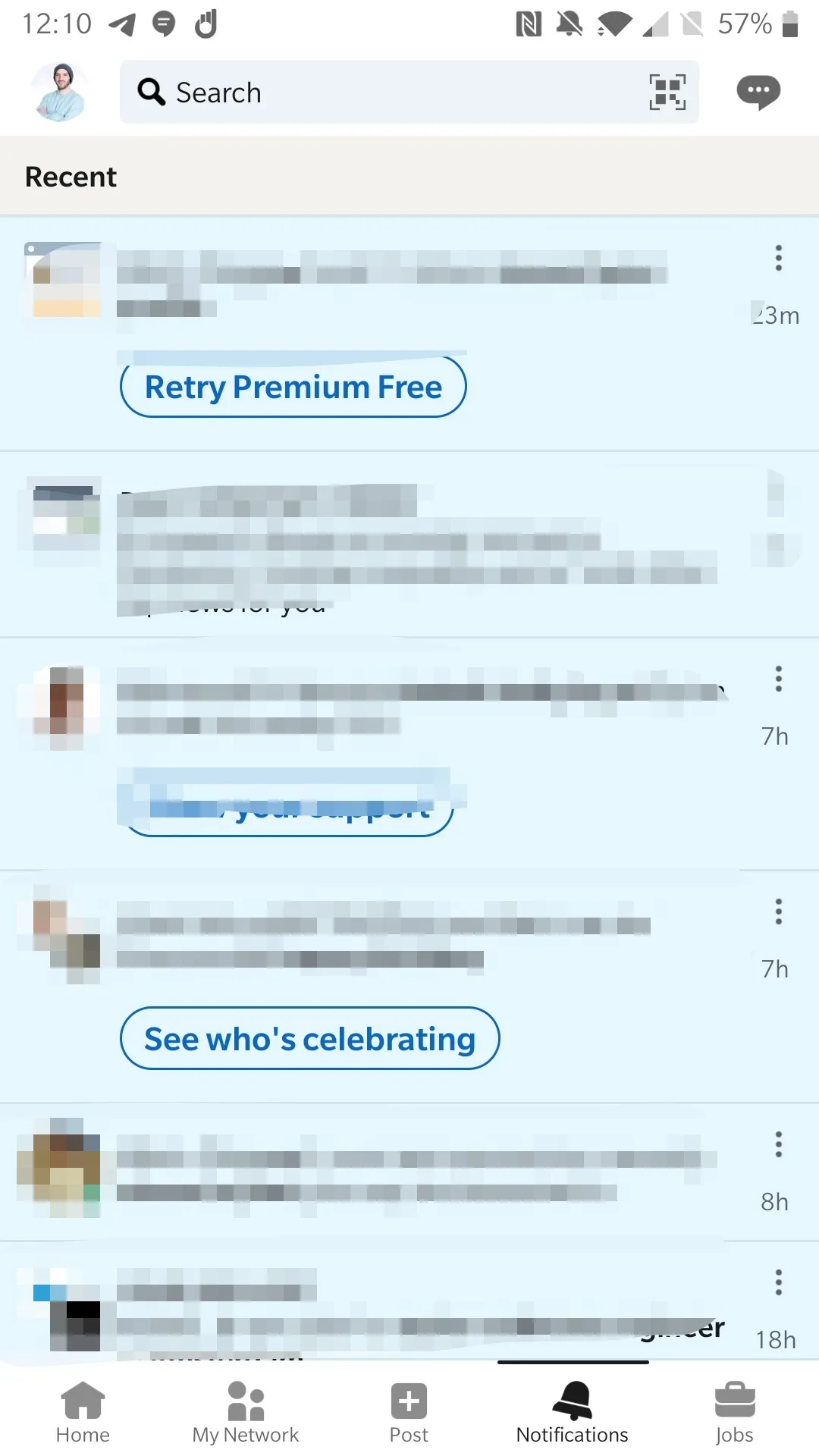
You can see the top bar has been changed as well

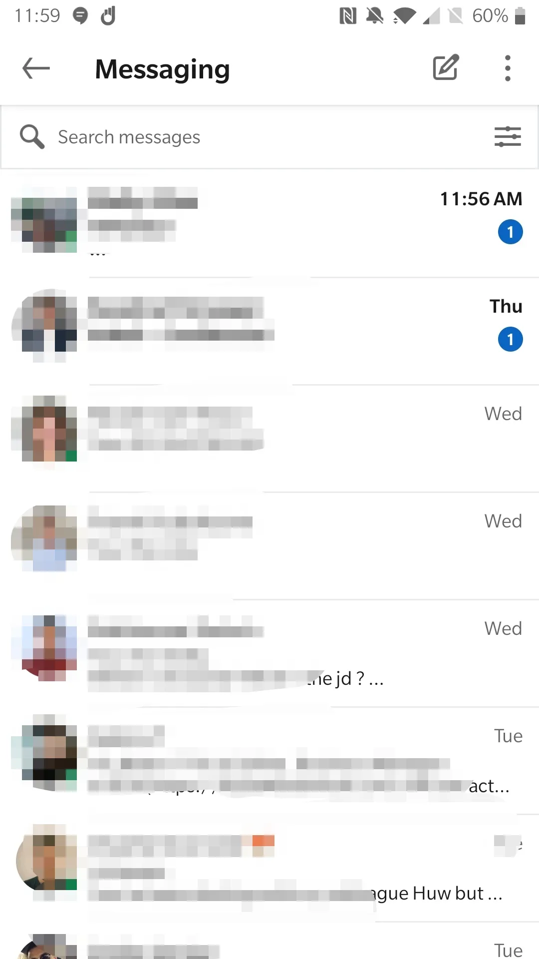
New design for the messages screen
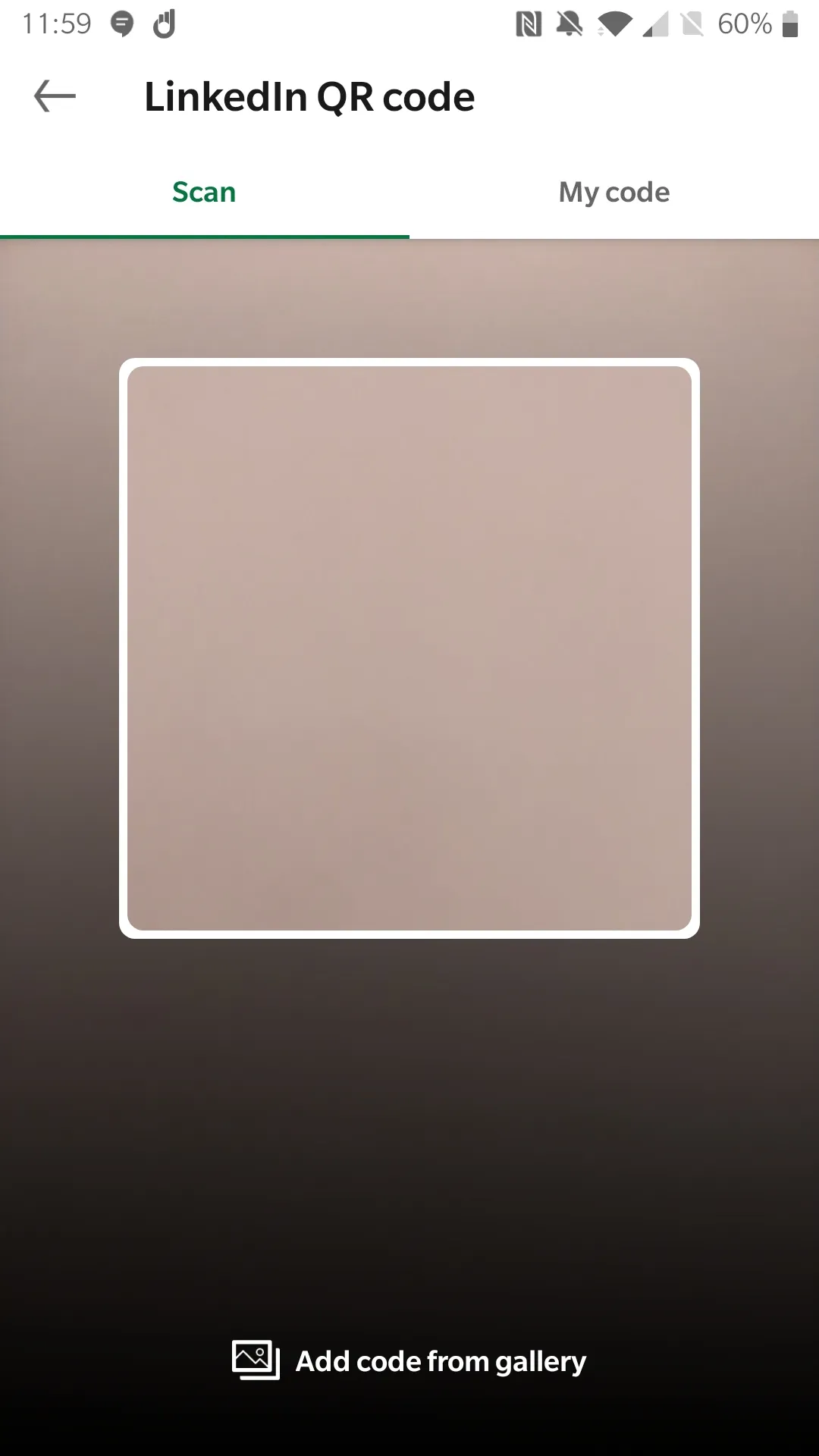
And I can see they’ve added some weird new search method by QR, which maybe was there before but wasn’t visible
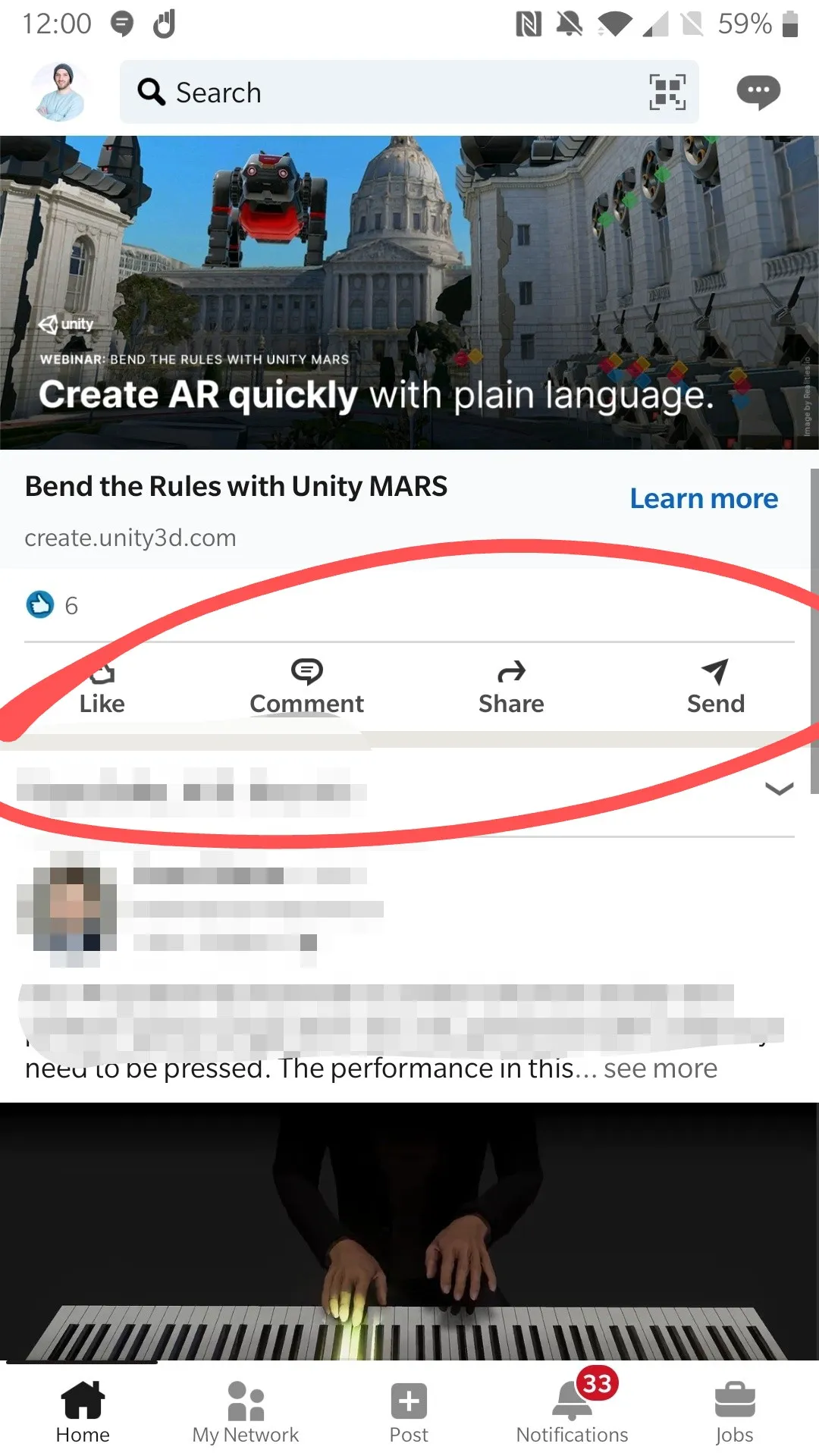
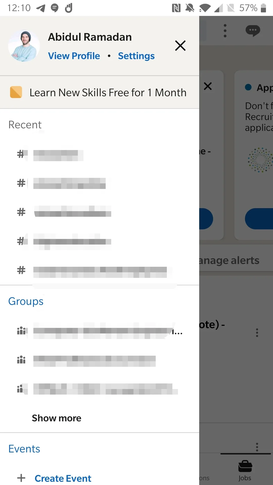
And the post has some small changes with a couple of other things that you can see below:
 This was a very quick review of the design I hope it was useful.
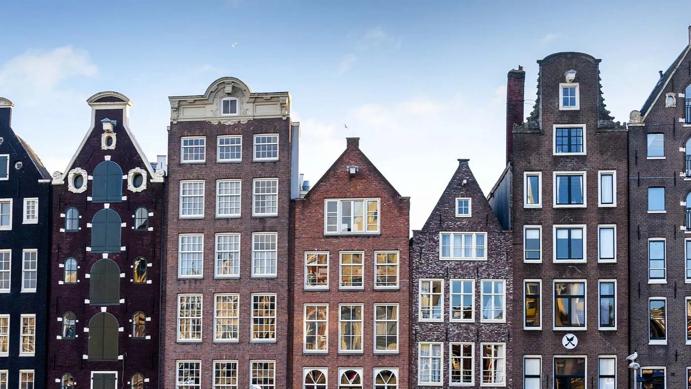 12 Things to consider when renting Apartments